Max Temperature
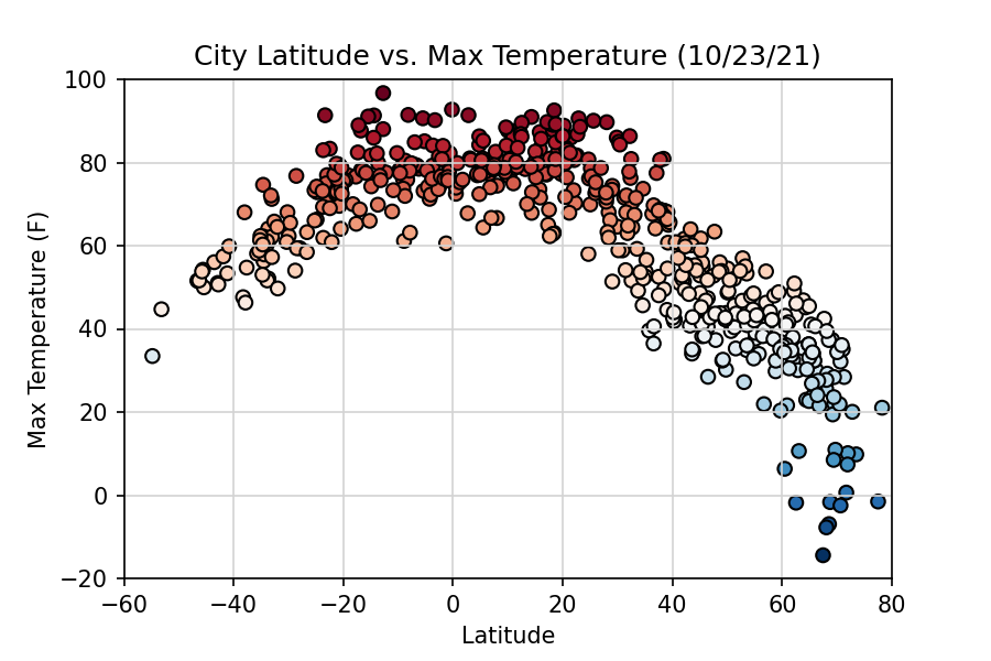
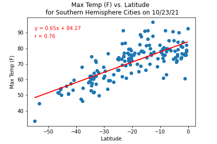
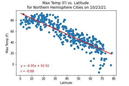
Each point in the above plot represents the observed high temperature for each of the random cities chosen on the day this analysis was performed. As expected, the temperature was warmer for cities nearer to the equator (Latitude = 0) than for cities farther away. The correlation between temperature and latitude is strong and is illustrated in the two graphs below. Notice that the temperatures for places in one hemisphere are relatively similar to those places in the other hemisphere that have the same distance from the equator. This is probably because the analysis was performed on a day close to the equinox, which meant that it was neither winter nor summer in either hemisphere. Although unrelated, it is interesting to note that the Northern Hemisphere appears to have more cities than the Southern Hemisphere and that there are more cities nearer to the North Pole than the South Pole.
